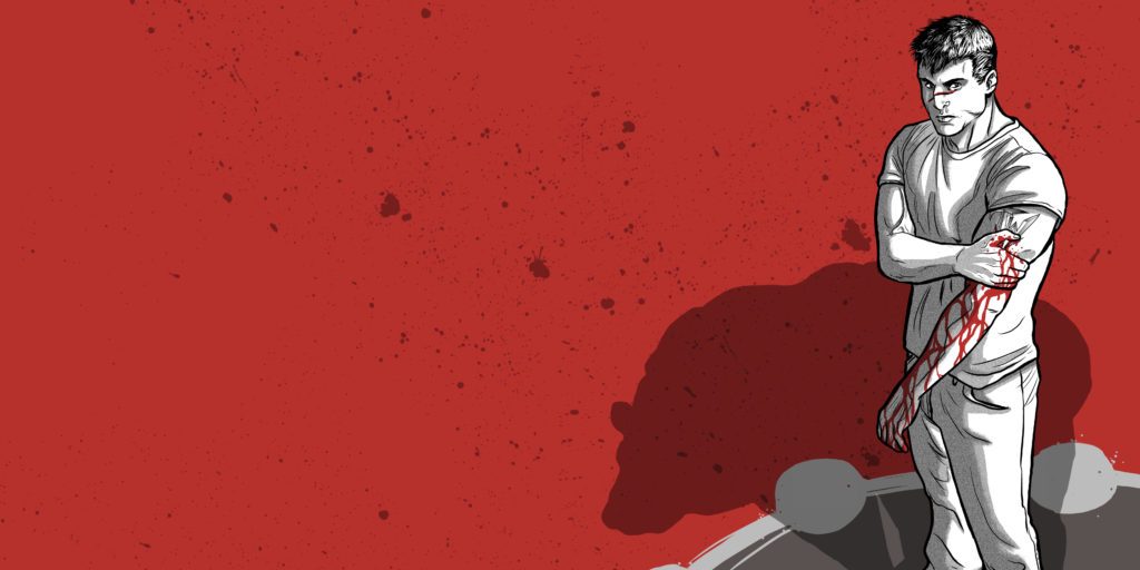
Original Artwork from The Outside Circle – Guest Post by Kelly Mellings
Throughout National Aboriginal History Month we’ll be highlighting works about Aboriginal history, including book excerpts, illustrator interviews, and author guests posts. The following is a guest post from Kelly Mellings, who illustrated The Outside Circle. Mellings has provided stunning original artwork, including 4 rough versions of the cover, as well as two mockups of the final cover.
 This was the first image I had in my head, and the one I thought was strongest. I was hoping Patti would like it. The grey tones were meant to make it feel more book-like, to entice new readers who might have never read a graphic novel. I thought that the image of Pete standing beside the outside circle would be compelling enough to draw new readers in, as it resembled a crime novel or movie poster. Perhaps it would make them think that the title represented him as an outsider. The blood down his arm could be a wound from a fight and the bear shadow was subtle enough that it might be missed at first.
Upon reading the book, they would discover the true meaning of the Outside Circle, that the blood is symbolic, and the bear his true spirit, giving the cover more significance. My fingers were crossed and thankfully, Patti felt the same!
I still quite like the simple composition of this one, and the layout allowed me to try a different title treatment within a circle. At the time, I thought that turning the main character away, and having his true self/his spirit bear facing forward, was a unique and intriguing approach.
Looking at it with cold eyes, I think that having Pete turning his back is not something that works symbolically with the themes of the book, and feels more melancholy than I wanted, but I’m glad I explored this direction.
Similar to my first idea, this one is just a different angle and zoomed in on our protagonist. I was also playing with the layout and design for this one.
I think it’s still pretty strong, and gets the point across, but I think it loses some of the impact with Pete looking down rather than confronting the reader with his gaze. If I had pursued this further, I think I would have had Pete looking at the viewer.
A portrait shot. This one is pretty strong too, and again, it feels like a movie or crime novel. I thought it might be good to focus on Pete’s facial scar instead of his tattoo. The blood is subtly forming a TW on his face (like the tears in Pete’s rage mask). This is the only one in which I introduced local colour, as I thought that the blood on his scar would be less intense on his skin tone. The confrontational gaze of Pete draws you in, but I feel that there is less revealed in this cover than the others.
Once Patti chose a cover, I started to mock up the book’s jacket. We weren’t sure what format it would be printed in, but I was secretly hoping for a hard cover with a dust jacket or at the least a soft cover with flaps (like the beautiful This One Summer by Jillian and Mariko Tamaki). Like my book thumbnails, the rough cover design is pretty close to the final version, as this is where all the design and layout issues are addressed. This is very similar to the frame of a house: all the important details are worked out, but it isn’t as pretty.
The layout for the cover was approved, and I went about subbing in the revised character sketch that would be more in line with how the final cover would look. After this was approved, I polished the illustration and design and the cover was born (sans flaps unfortunately).
Kelly Mellings is an award-winning art director, illustrator, and designer. His work has appeared in comic books, magazines, apps, museum exhibits, and online games, and his clients include Microsoft. He is the co-owner of the acclaimed illustration, animation, and design firm Pulp Studios.


